
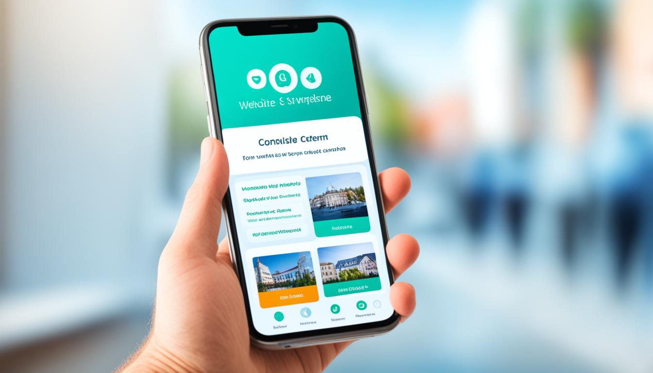

Did you know that over 60% of internet traffic now comes from mobile? Focus on mobile optimization, then yours will be adapted Homepage for smartphones and tablets. Yours does Homepage user-friendly on all screen sizes and enhances your online presence.
Google now ranks websites based on their mobile version first. Klikko's SEO specialist, Manne Högström, points out that mobile optimization is vital. It affects both the user experience and your visibility in search engines.
What you want to learn
- The importance of mobile optimization for your website
- How responsive design improves the user experience
- Specific techniques for mobile optimization and mobile SEO
- Effective methods to increase page loading speed on mobile
- How a mobile friendly Homepage can improve your online visibility
In this article you will learn how to optimize your website for mobile. We look at techniques for better mobile experiences and search rankings. Let's explore how to make your website mobile friendly.
The importance of a mobile-friendly website
It is important to have one mobile friendly website in today's digital world. More and more people use their mobile phones to surf the web. So it is important that your website mobile is easy to use.
This not only makes your visitors happy. It also helps create a strong image of your brand. It shows that you are a professional.
Having a good one mobile user experience is important to keep people. Google prioritizes mobile-friendly pages when appearing in search results. So in order to be seen, your page must be ready for mobile use.
One mobile friendly website make your site easy to use on all devices. It increases the chances that people will enjoy their visit. This is good both for the users and your site's position in the search results.
Using responsive design
Responsive design adapts to the user's device. This ensures a good user experience. This approach has changed how websites are built and it works on many different devices.
What is Responsive Design?
The homepage layout automatically changes to the device's screen size with responsive design. That way, content and navigation always look good. Regardless of whether it is on a smartphone, tablet or desktop.
Advantages of responsive design
Responsive design increases your website's visibility on Google. It makes your site more mobile friendly. It also significantly improves the user experience.
This makes maintenance easier. You save time and resources because you only have to handle one version of your website.
| Advantage | Description |
|---|---|
| Search engine ranking | Improves visibility on Google due to mobile friendly design |
| User experience | Ensures easy navigation and readability on all devices |
| Ongoing maintenance | Eliminates the need for separate versions of the website |
Optimizing page load speed
Speeding up your website is important to improve its performance. Mobile speed is particularly important as it affects how users experience your site. A fast website can increase engagement and decrease the number of people who leave the page quickly.
Why is loading speed important?
The speed at which your website loads is the key to success. If it's slow, it can make people give up and leave. But a fast website can improve your search engine ranking and attract more visitors.
Techniques to improve loading speed
- Compressing images: Large images can slow down your website. Use techniques to make files smaller without losing quality.
- Use of caching: Saving versions of your site can make repeat visits faster.
- Minification of JavaScript and CSS: By making these files smaller, you can improve your website's speed.
- Asynchronous loading: When important parts of your site load first, the user experience improves.
Efficient navigation on mobile devices
A good ease of use on mobile requires efficient navigation. It is important to use one mobile design that makes it easy to access important functions. A smart way to do this is by having a hamburger menu. It helps save space and makes navigation simple.
To succeed, focus on your mobile menu. The buttons must be large and easy to press. It's a good idea to keep the menu simple to avoid clutter. This also improves ease of use on mobile.
Insert internal links and clear calls to action, CTAs, to improve navigation. This helps users find the most important parts of your website quickly. By using these methods, your efficient mobile navigation better and you improve the user experience.
Optimizing mobile users: Content and functions
To optimize for mobile, it is important to think about your content and features. A good structure makes the content suitable for mobile screens. Mobile usability features improve how people interact with your site.
Prioritization of content
Content for the mobile phone must be short and precise. Use intermediate rubrics and bulleted lists to make your texts easy to understand. Also, make sure images are both high quality and quick to load.
- Short and concise texts
- Use intermediate headings
- Bulleted lists for easy readability
- Optimized high quality images
Mobile-specific features
Adding unique mobile features can increase how much users interact. For example, click-to-call buttons can make it easy to make a call. Location-based services offer content appropriate to where the user is. These additions make the user experience better and increase the chances of conversions.
| Function | Description | Advantage |
|---|---|---|
| Click-to-call | The user can call with a single tap | Increased ease of use and direct contact |
| Location-based services | Content is adapted according to the user's location | Relevance and personalization of content |
With good mobile content and smart mobile functions give your visitors a top experience. Your website will be easy to use on all kinds of devices.
Use of Google's tools
To get one mobile friendly website, it is important to use Google's tools. Use Google PageSpeed Insights to check how fast your page loads. It gives you tips on how to make your website faster, especially on mobile.
Google Search Console is also a key to success. It has a section called 'Mobile Usability' which shows how your site performs on mobiles. You will be told what errors there are and how to fix them. Following these tips will make your site more user-friendly.
Use Google PageSpeed Insights and Google Search Console on a regular basis. It helps you find and fix errors. Plus, you ensure that your website is always up to date. These mobile SEO tools are important to continue to perform well in search engines.
FAQ
How do I optimize my website for mobile users?
To optimize your website for mobile users, you need to focus on mobile SEO and responsive design. This ensures that the website works well on mobile phones. Your website will automatically adjust to the screen size. This improves the experience for those visiting your site from a mobile.
Why is it important to have a mobile-friendly website?
It is important to have one mobile friendly website, because many people use their phones to go online. This means that more people will engage with your content and buy what you sell. Google also rates websites based on mobile friendliness, which affects your online visibility.
What is Responsive Design?
Responsive design means that your website automatically adapts to the device it is displayed on. This means your content looks great whether it's on a phone, tablet or computer. This makes navigation easy and the content readable for all users.
What are the benefits of responsive design?
With responsive design, your website gets better rankings in search engines. The user experience will also improve. It makes the website easier to maintain as you don't need multiple versions for different devices. These benefits make your website more efficient and accessible.
Why is loading speed important?
Fast loading time is very important for mobile users. It keeps users' attention and reduces the chance of them leaving your site. A fast website can also improve sales and user experience.
What techniques can I use to improve loading speed?
To make your website faster, try compressing images and using caching. Also minimize the use of JavaScript and CSS. Asynchronous loading can also help. These measures will make your website faster for mobile users.
How do I ensure efficient navigation on mobile devices?
Good mobile navigation requires large buttons and a simple menu. A hamburger menu can also help. This makes it easy for users to find their way around your website. This improves the user experience.
How do I optimize content and features for mobile users?
Optimize your content by making it easy for mobile users to scan. Use short texts and intermediate headings. Mobile-specific features such as click-to-ring are also good to have. It improves the user experience on mobile and can increase your sales.
Which Google tools can I use to optimize my mobile site?
Google's PageSpeed Insights and Mobile Usability reports are important for understanding your mobile site's performance. They show what can be improved for a better mobile experience. Use these tools to make your website better for mobile users.